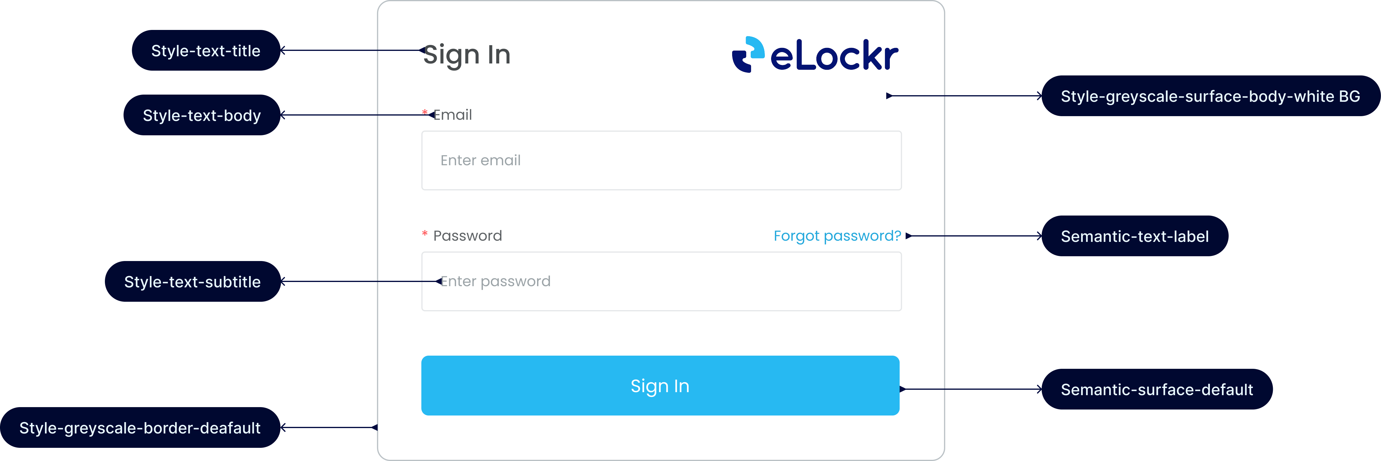
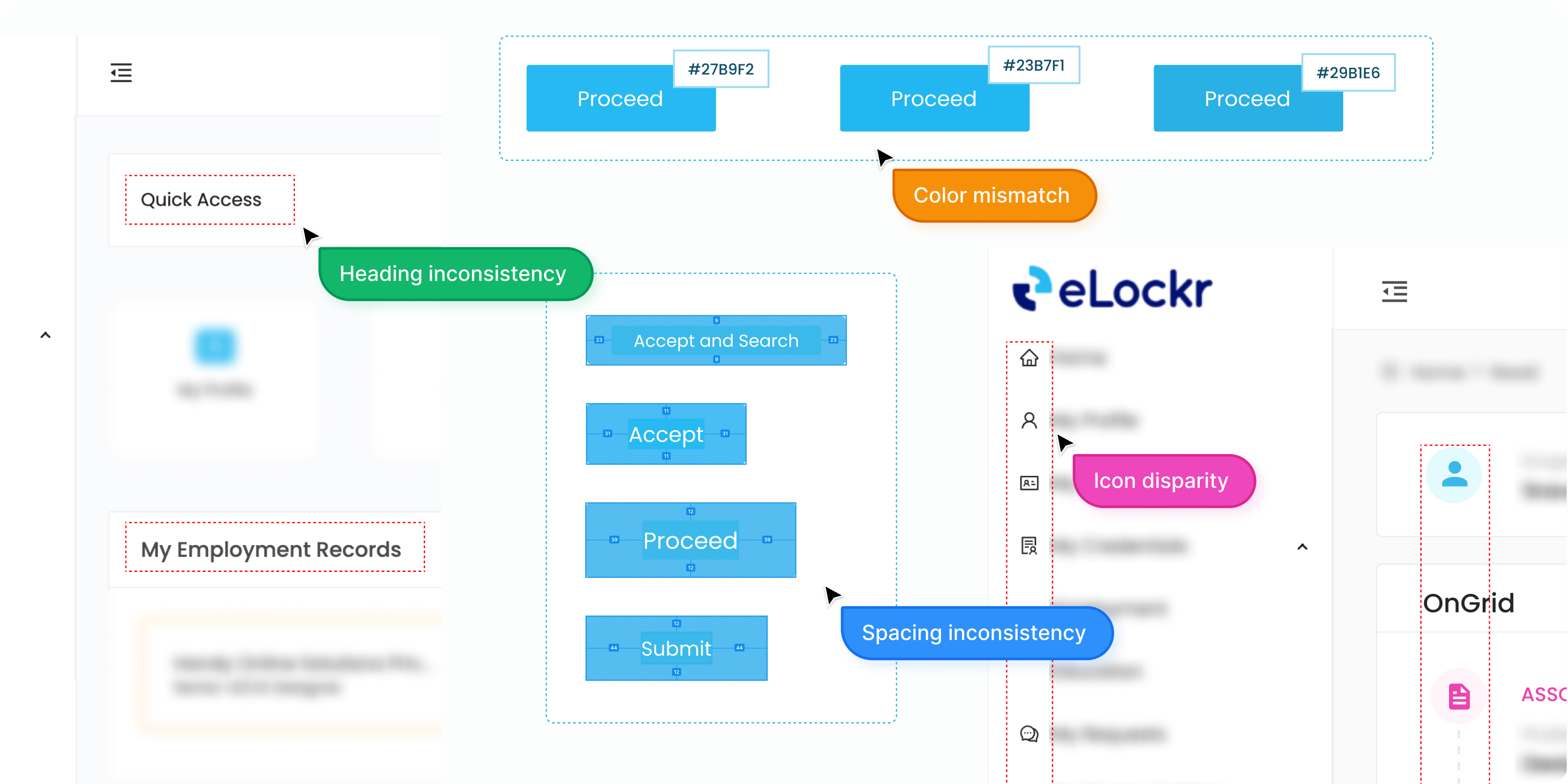
Building the eLockr Design System

How I transitioned our product from a "solo designer" workflow to a scalable team foundation.

eLockr Design System Cover

The Backstory

For the first year of elockr, I was the sole designer. I moved fast. "Consistency" lived entirely in my head. I knew that the primary blue was #27B9F2 and that we used 20px horizontal and 12px vertical padding on buttons. I didn't need documentation because I was the only one touching the files.

The Turning Point

As the product gained traction, our team expanded. Suddenly, we went from 1 designer to 3. Product Managers started assigning tickets to new team members, and almost immediately, the cracks appeared.

I noticed the design files starting to drift. One designer used a slightly different blue; another used 18px font instead of 20px. We were wasting time in design reviews debating pixel values instead of solving user problems. I realized that my "mental model" was becoming a bottleneck. We needed a single source of truth—not just a style guide, but a system.

Design Inconsistency Examples

The Strategy: Logic Over "Pretty"

I didn't have months to stop everything and build a massive system like Material Design. We were a startup; we had to keep shipping.

My approach was incremental and logic-first. I wanted to build a foundation that explained how the design works, not just what it looks like. I decided to use Figma Variables to create a tokenized architecture that would handle the math for us.

Strategy Diagram

Step 1: Cleaning the Data (The Primitives)

I started by auditing our live product. It was messy—we had about 12 different shades of grey and random spacing values.

I standardized these into what I call "Primitives." I defined a strict 50–900 scale for our neutrals and brand colors. This gave the team a limited palette to paint with, removing the paralysis of choice.

Color Primitives

Step 2: Creating a Shared Language (Semantic Tokens)

This was the most crucial step. I didn't want the team thinking in hex codes (like #EB5757). I wanted them to think in intent (like Surface/Error).

I mapped our primitive colors to semantic names.

  • Why I did this: If we decide to rebrand elockr next year, or add admin Mode, we don't have to find-and-replace every screen. We just update the logic in one place.
Semantic Tokens

Building the "Legos" (Components)

Once the math was set, I moved to the components. I focused on the high-impact elements first: Buttons, Inputs, and Navigation.

The Button & Input Architecture

I built these using the "Atomic" method. I didn't just draw a rectangle; I built a master component that could handle every state we needed:

  • Type: Primary, Secondary.
  • State: Default, Selected, Hover, Focussed, Disabled.
  • Sizing: Small, Medium, Large.
  • Icon: None, Left, Right, Alone.

I spent extra time ensuring the touch targets were accessible (min 44px) so that the system would work well on mobile, not just desktop.

Button Component States

The "T-Shirt Sizing" Breakthrough

One of the biggest wins was how I handled spacing and radius. Developers hate guessing if a corner radius is 4px or 6px.

I created a "T-Shirt Size" token set (Small, Medium, Large) for things like Radius and Spacing.

  • Radius/S = 4px
  • Radius/M = 8px
  • Radius/L = 16px

Now, when a designer says "Make that button rounded," we just say "Use Radius Medium." It aligned our design language with the engineering code.

T-Shirt Sizing Tokens

The Result

This wasn't an overnight fix, but the impact was felt immediately.

Speed

Speed

The new designers ramped up much faster. They stopped asking me, "What grey is this border?" and just used the Border/Default token.

Consistency

Consistency

Our recent feature release was the first one where the UI looked completely unified across screens designed by three different people.

Developer Happiness

Developer Happiness

The engineers stopped guessing spacing values. They mapped my tokens to their CSS variables, making the handoff seamless.

Want to see more?

Get in touch.