OnGrid Verifier App

From Chaos to Conversation

How rethinking a single workflow saved the Operations team from burnout and boosted revenue.

Role
Senior Product Designer (Lead Strategy & Design)
Impact
60% Revenue Increase, 83% Reduction in Churn
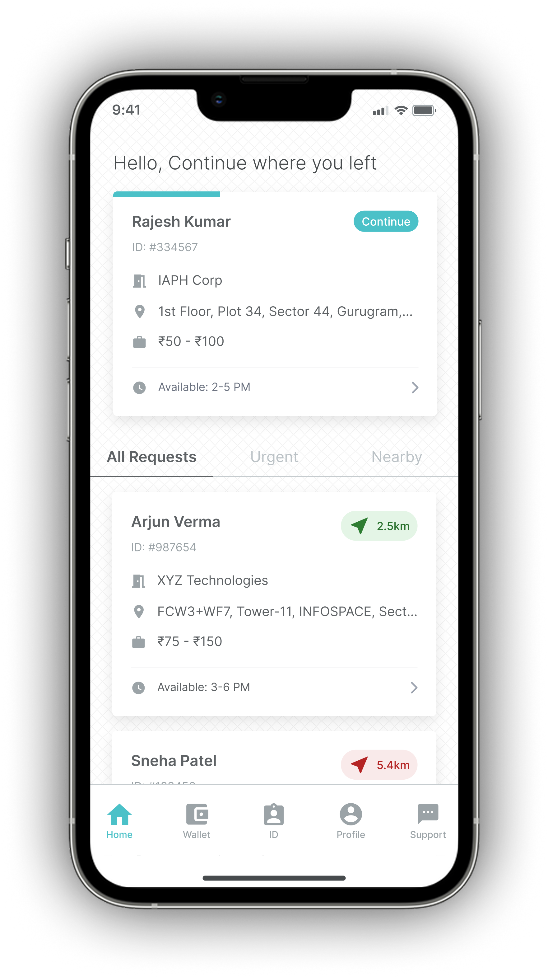
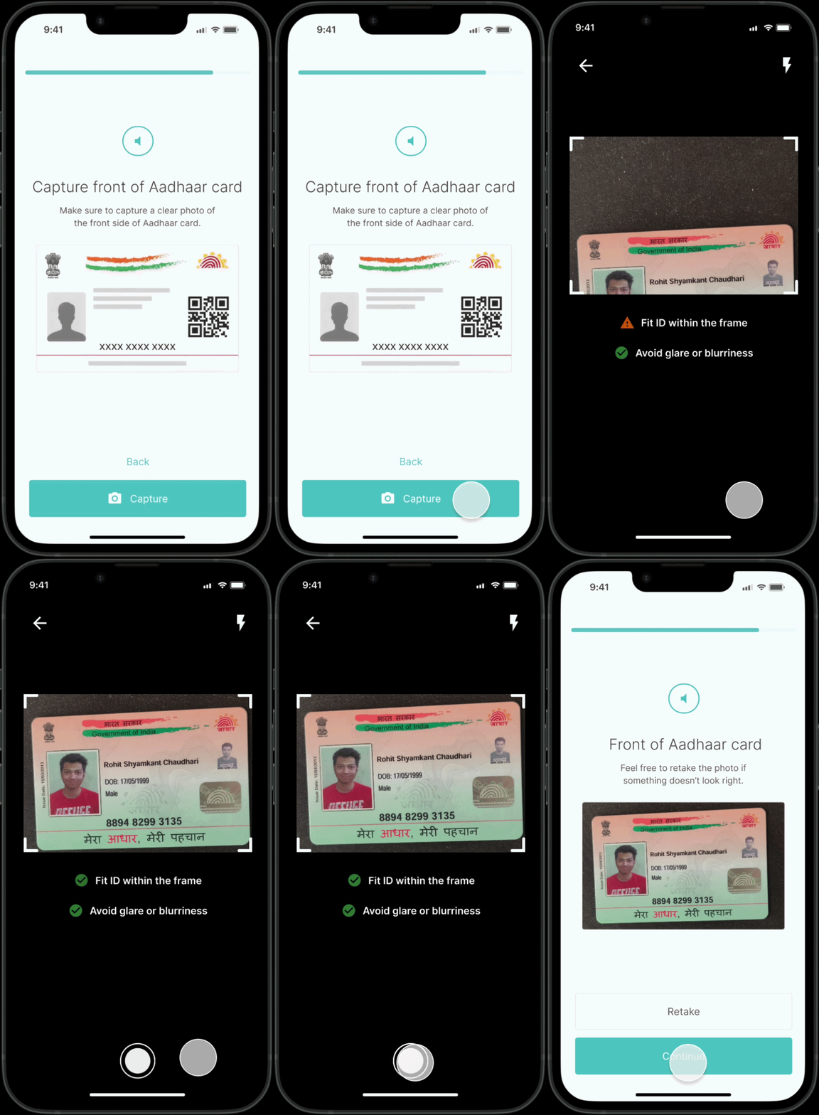
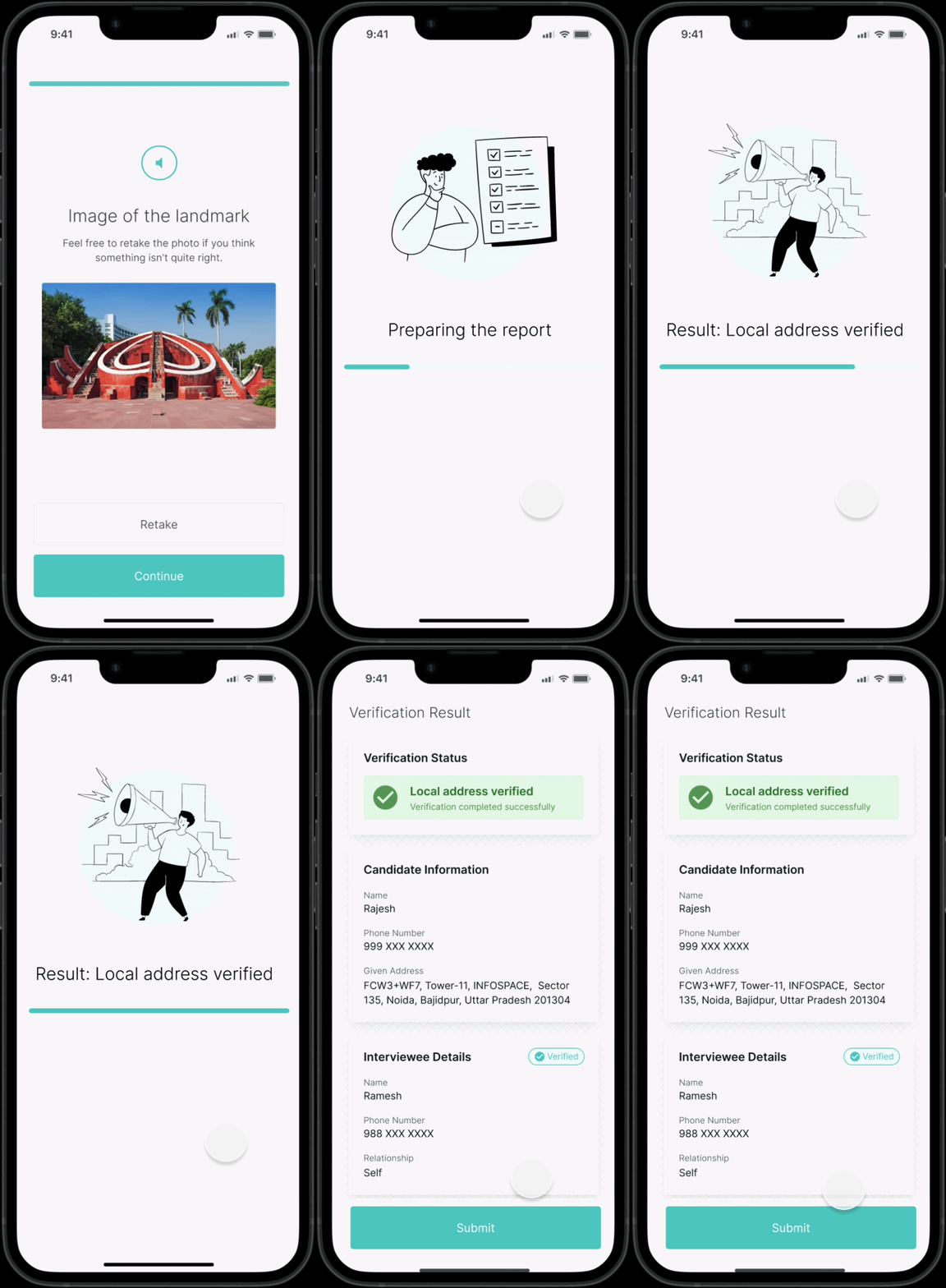
ONGRID App Screenshot

The Context: A Leak in the Funnel

Address verification is the backbone of OnGrid's business, relying entirely on a network of field agents ("verifiers") to visit locations and collect data. But despite the demand for the service, our operations were bleeding efficiency.

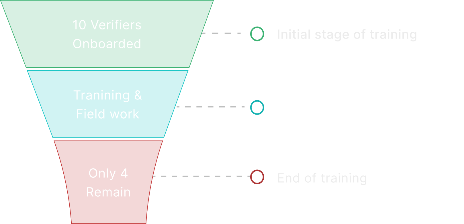
We were losing 6 verifiers for every 10 we onboarded. The drop-off rate was unsustainable, and for those who stayed, data errors were common. This created a bottleneck: Operations teams were burned out from constant retraining, and client deliverables were delayed due to rework.

The assumption was that the app was simply "outdated." My job was to figure out if a redesign could fix the operational bleed.

Funnel Diagram

The Reality Check

I started by auditing the existing experience, which was admittedly clunky. But bad UI rarely causes a 60% churn rate on its own. To understand the real friction, I stepped away from the desk and interviewed the people doing the work—6 verifiers and 3 operations leads.

The conversations revealed a massive gap between how we imagined the job and how it actually happened.

The Verifier Reality

Most were gig workers, often juggling this with food delivery. They were stressed, time-poor, and anxious about getting paid. One told me, "I worry I'll pick the wrong scenario and my work will get rejected."

The Operations Reality

They were trying to teach complex logic to a transient workforce. "We spend days training them on 10 different edge cases," a manager told me, "but on the field, they just forget."

The Core Problem: Cognitive Overload

The insights pointed to a clear root cause. We weren't suffering from bad design; we were suffering from misplaced complexity.

The existing app forced verifiers to act like data analysts. They had to visit a site, assess the situation, recall the training manual, and categorize the outcome (e.g., 'Address Untraceable' vs. 'Does Not Reside').

We were offloading the system's logic onto the user's brain. In a high-pressure environment, that cognitive load was leading to errors and abandonment.

High cognitive load

High cognitive load

Cognitive load transformation arrow
Low cognitive load

Low cognitive load

The Strategy: Designing for the "Gig" Mindset

The solution wasn't to make the app prettier; it was to make it smarter. My strategy centered on one principle: Shift the cognitive load from the user to the system.

We needed to stop asking verifiers to decide and start asking them to observe.

The Solution: A Guided Workflow

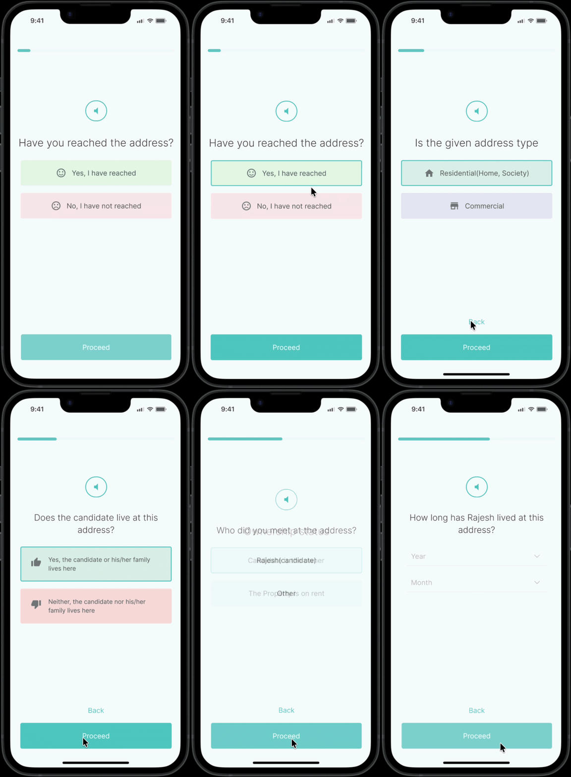
I replaced the complex decision menus with a linear, conversational interface.

  • Before: Users had to select the correct outcome from a list of technical terms.
  • After: The system asks simple, binary questions based on the previous answer.
  • "Did you reach the address?" (Yes/No)
  • [If No] "Is the address searchable on maps?" (Yes/No)

The verifier provides raw input; the backend logic determines the scenario. This seemingly small shift changed the user's role from "Judge" to "Witness," drastically lowering the barrier to entry.

Old and New design comparison

Building a Scalable Mini-Design System

Consistency was critical for a tool used in high-speed environments. I didn't just design screens; I built a system to ensure the product could scale without accumulating design debt. I created a mini design system in Figma, grounded in design tokens for color, typography (Inter), spacing, and sizing. By using Figma variables and semantic aliases (e.g., mapping Brand-Teal to Action-Primary), I ensured that future updates would be seamless.

I also built a library of atomic components—from interactive input cards to status badges—allowing the engineering team to assemble new flows rapidly. This system bridged the gap between design and code, reducing development time and ensuring a unified experience across the app

Design System Assets

The Impact

We released the redesigned flow and monitored the metrics over Q2. The results validated that reducing mental effort drives operational success.

60% to 10%

Stabilized the Workforce

Verifier drop-off plummeted from 60% to 10%. By making the job easier to grasp, people stayed longer.

50%

Business Growth

With faster, more accurate submissions, our capacity increased, leading to a 60% rise in address verification revenue.

Timer

Operational Efficiency

Training time was cut significantly. Operations executives moved from "firefighting" and constant recruiting to focusing on quality audits.

Want to see more?

Get in touch.