9 changes across the platform.
Each solution maps directly to a research insight. Nothing was redesigned for aesthetic reasons alone — every change was driven by observed behavior, error patterns, or measured friction.
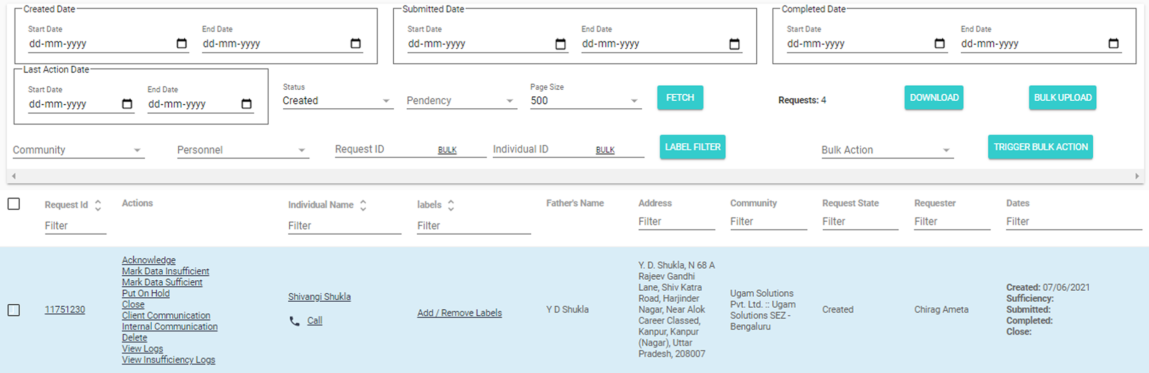
Solution 01
Search & result customization
The problem
Search was one-size-fits-all. Every session began with the same manual filter reconfiguration — before any real work could start. Operations Executives, Account Managers, and Team Leads each needed completely different result views, yet the tool served them identically. A repeating tax on every user, every day, before they could even begin their actual task.
Configurable filters, column preferences, and result sorting are now saved per user role. The system remembers the setup. Users arrive at their working context immediately — filters pre-applied, columns relevant to their workflow, results scoped to what they actually need. The experience shifted from system-driven to user-driven, aligning search behaviour with individual task priorities.
↓ 39% avg. task time
Role-specific defaults
Before
After
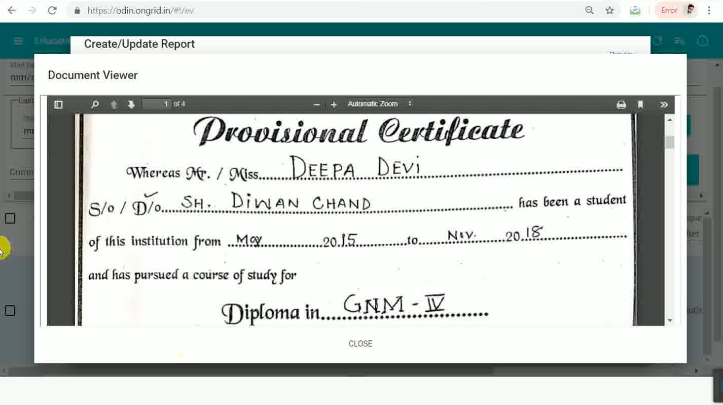
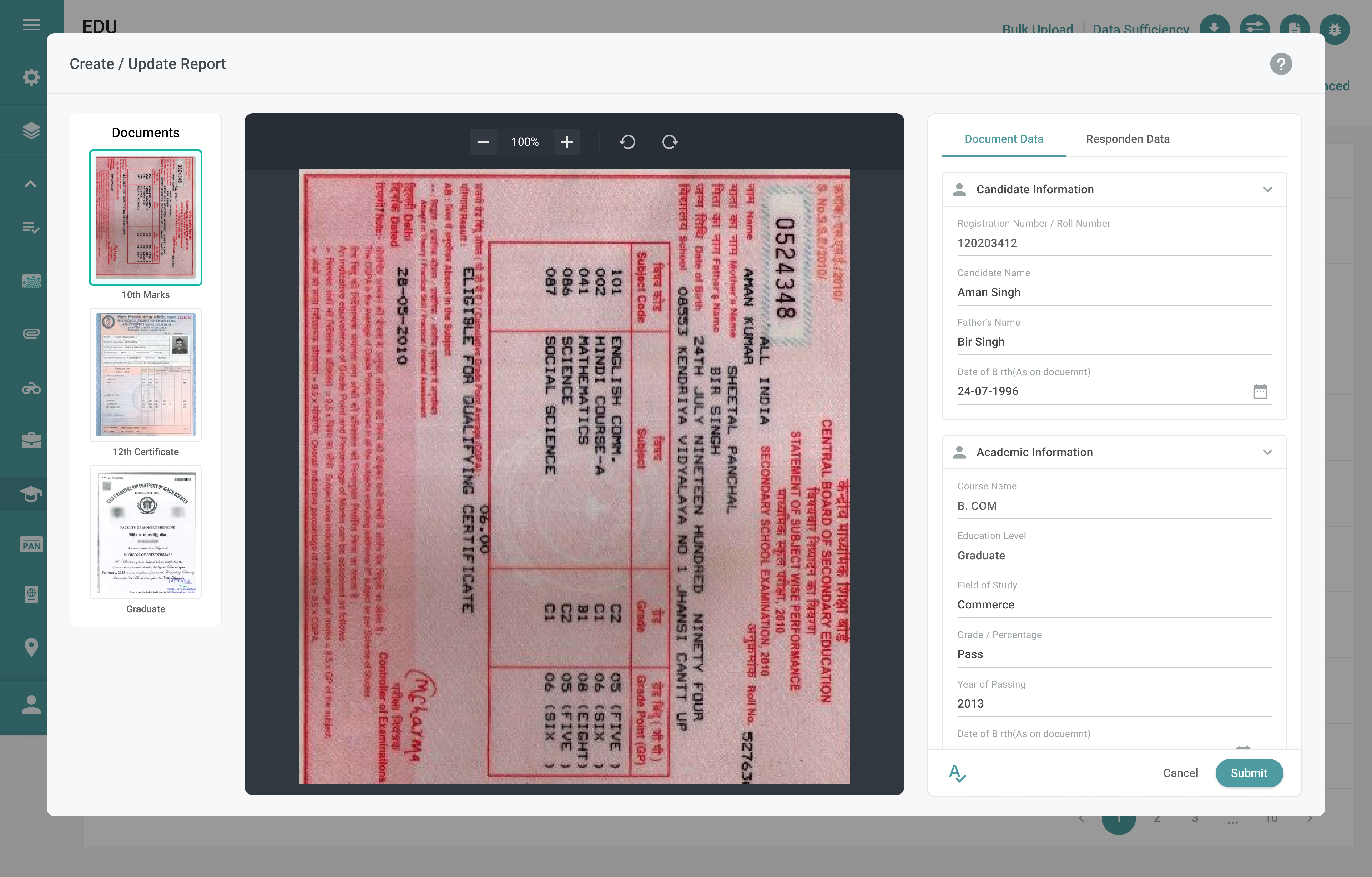
Solution 02
EDU document viewer
The problem
Education verification required verifiers to juggle two completely separate contexts. The candidate's data — institution name, dates, degree title — lived on one screen. The supporting documents — scanned certificates, transcripts, mark sheets — lived on a different portal entirely. Verifiers had to open the verification details, navigate away to the document portal, memorise what they saw, return to ODIN, and manually compare from memory. This context-switching wasn't just slow — it increased verification errors. Working from memory while comparing details is a reliable way to miss discrepancies. On top of this, uploaded documents frequently arrived as rotated scans or poorly cropped images. Without any built-in document tools, verifiers downloaded files, opened them externally, and worked entirely outside ODIN to correct orientation before they could even begin verifying.
The redesigned Education Verification workspace consolidates everything into a single view. Candidate-entered data and uploaded supporting documents are displayed side by side — verifiers see the degree certificate and the institution name field simultaneously, without switching screens. Cross-referencing is now a visual task, not a memory task. Document utility tools — rotation, zoom, and crop — are integrated directly into the viewer. Verifiers correct orientation and focus on the relevant portion of a document without leaving ODIN, without downloading files, and without breaking their verification flow. Related actions are grouped in the same workspace, so the entire task — review, compare, verify — happens in one place.
Zero context switching
Docs + data in one view
Built-in crop & rotate
Before
After
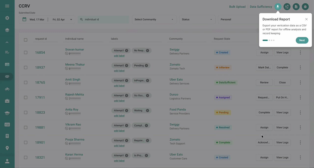
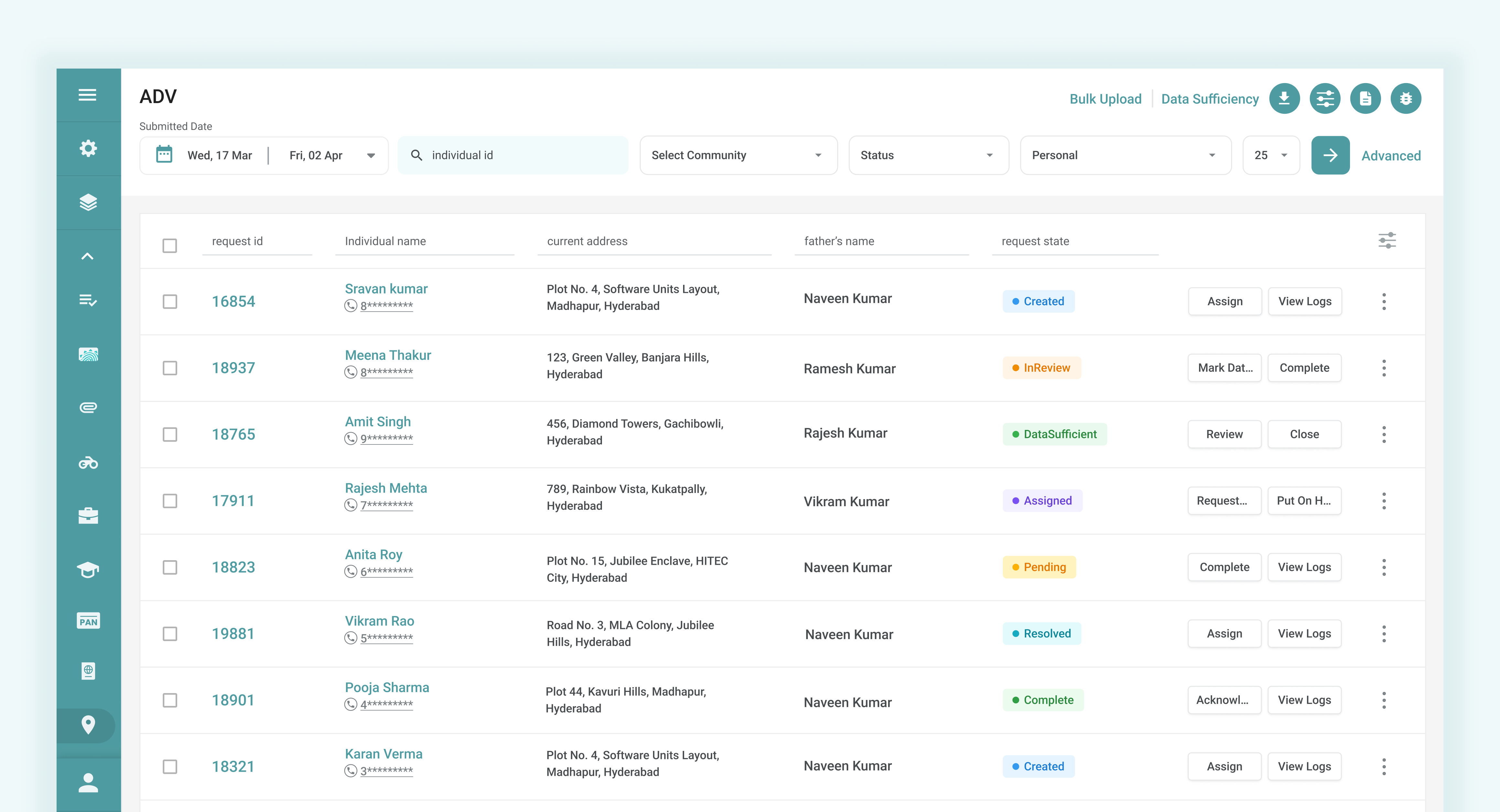
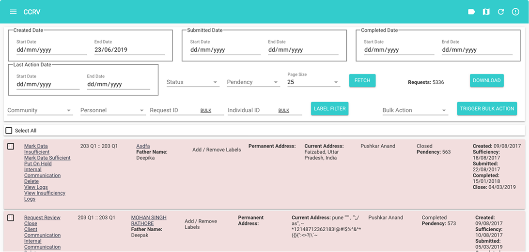
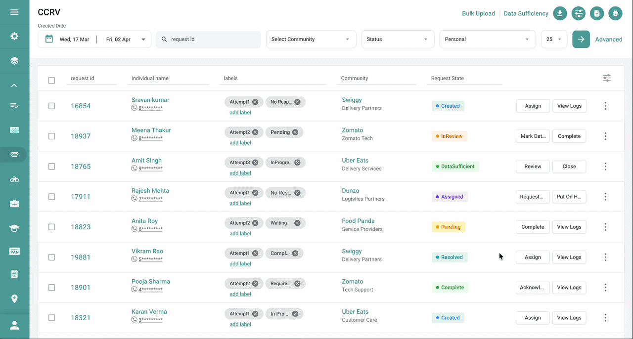
Solution 03
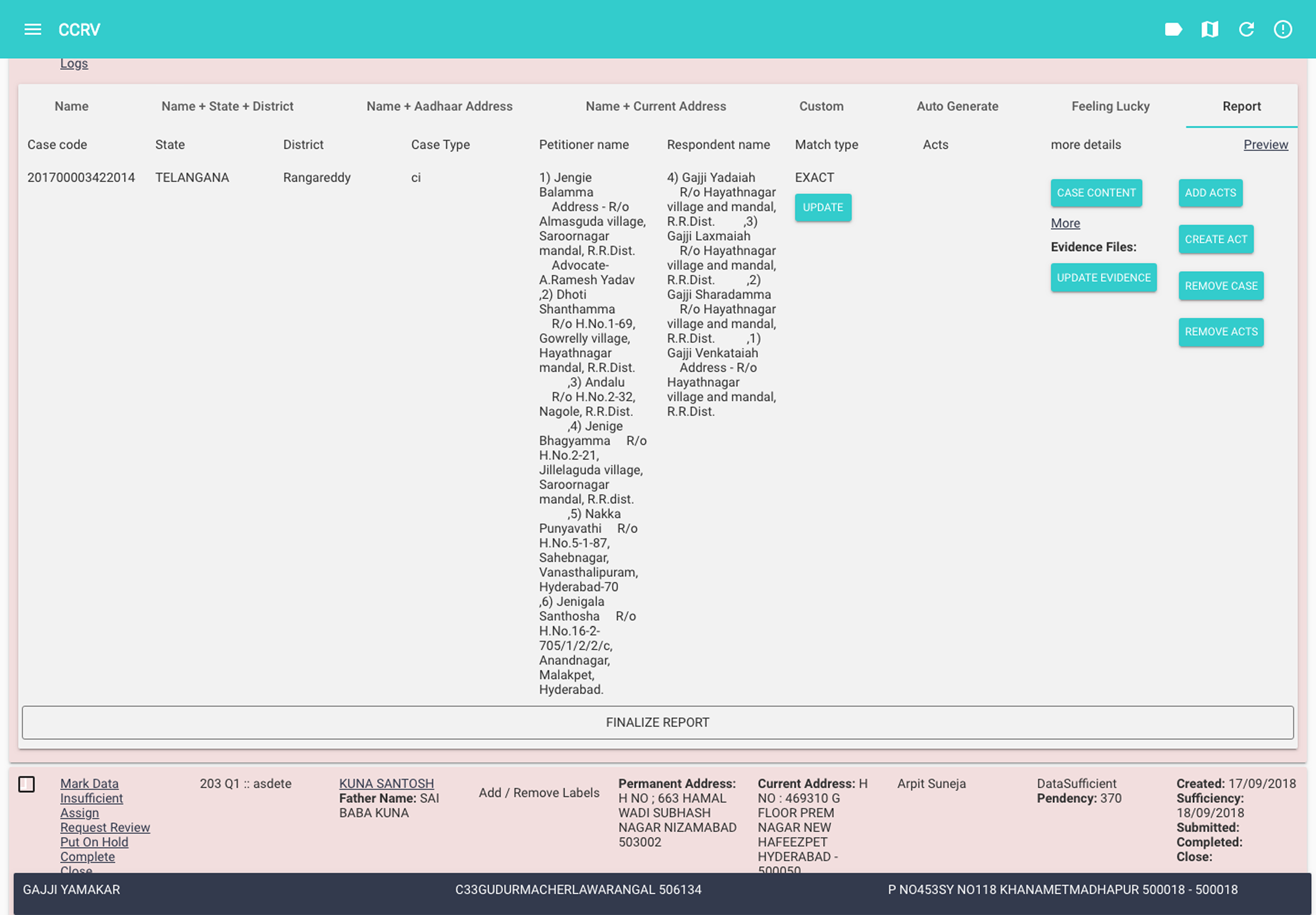
CCRV — Criminal Case Review & Verification
The problem
A high-stakes, irreversible confirm/reject decision was shown inside the full cluttered interface. Navigation, filters, and background list items competed for attention at the worst possible moment. Users had also normalized using Ctrl+F — the browser's native find tool — to search within the criminal case list. A broken workaround no one had flagged until we watched them work.
A dedicated modal dialog now isolates the decision from all surrounding UI. The background disappears. The user's full attention is on the case details and the confirm/reject action — nothing else. For the search problem, a built-in contextual search tool replaces Ctrl+F, with semantic tokens (case type, date, jurisdiction) so users can search the way they think, not the way the system stores data.
↓ 59% CCRV error rate
8.2% → 3.4%
Before
After
Solution 04
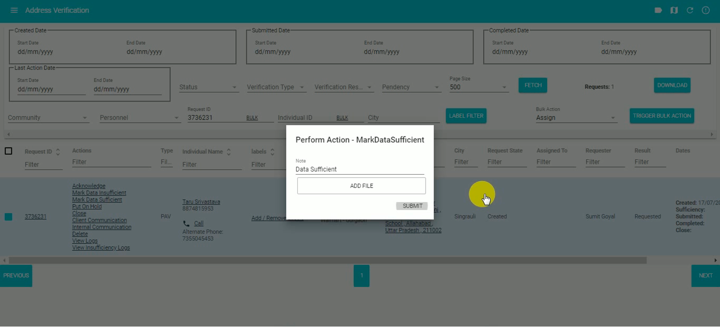
Data sufficiency — from 11 clicks to 4
The problem
Verifying whether a candidate had provided required documents meant opening the request, navigating to a separate candidate portal, reviewing their uploads, then returning to ODIN to mark it sufficient or insufficient. 11 clicks across two portals — for a task performed dozens of times per day.
A contextual dialog inside ODIN now consolidates candidate information, document uploads, and the mark-as-sufficient action in one place. Users review and act without leaving the tool. The journey went from 11 clicks to 4 — and the cognitive overhead of context-switching went with it.
↓ 64% click reduction
11 → 4 clicks
Before
After
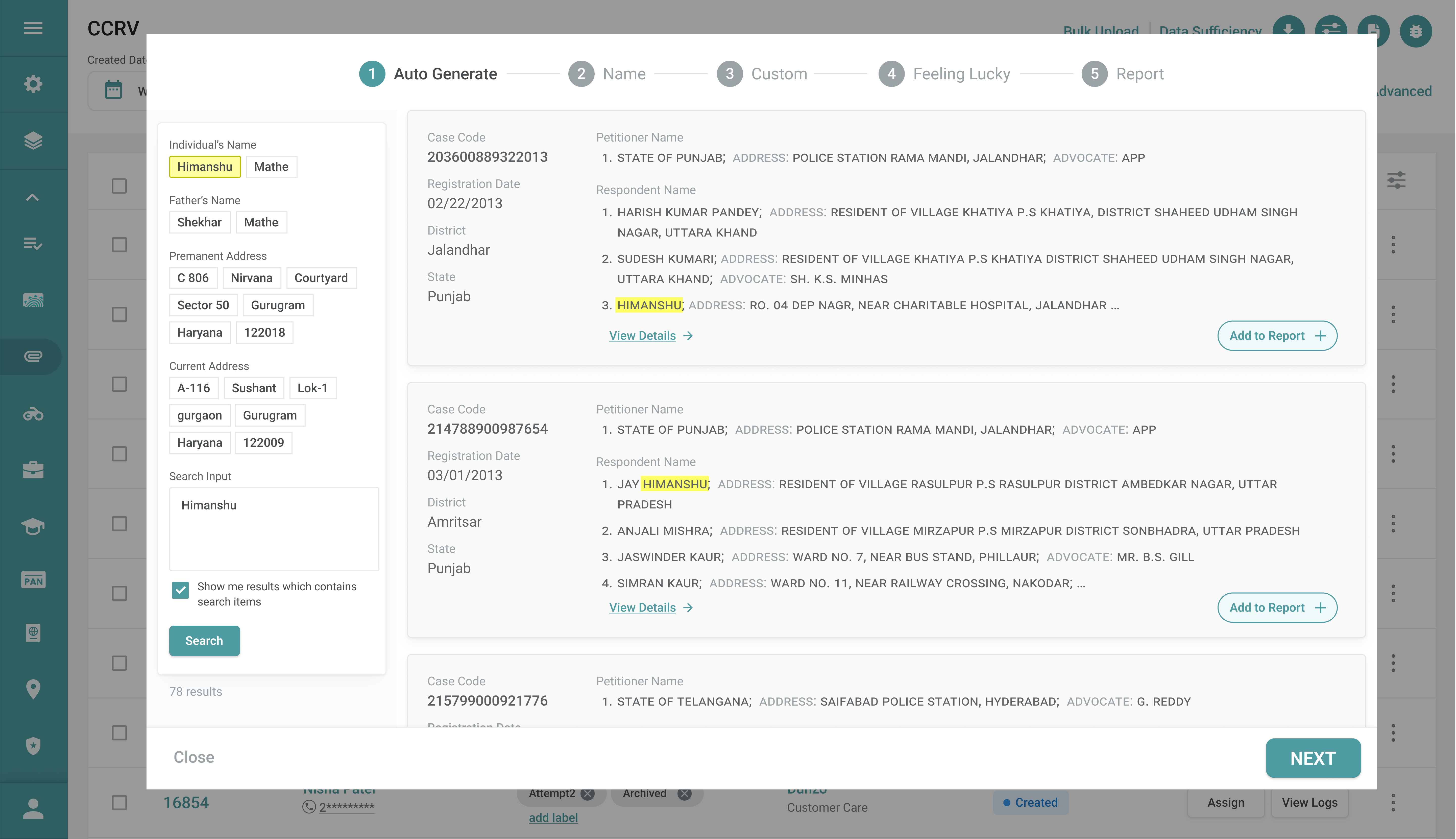
Solution 05
Next-action prediction
The problem
Every possible action for a request was displayed in each table row — maximum visibility, but extreme visual noise. Hard to scan, easy to misclick, and consuming disproportionate screen space. With hundreds of requests on screen, the cumulative cognitive load was significant.
Only the 2 most contextually relevant actions are now shown per row — based on the current workflow state. All additional actions are available via a secondary side drawer. Progressive disclosure reduces clutter without hiding flexibility. Less to read, fewer errors, faster decisions on every row in the table.
Before
After
Solution 06
Persistent sticky sidebar navigation
The problem
The hamburger menu hid navigation by default. Every time a user needed to switch sections — a constant requirement in an operational tool — they had to open the menu first. A small tax per interaction that compounded across hundreds of daily navigations into a meaningful productivity drain.
Navigation was converted to a persistent sidebar with visible icons — always accessible, single-click switching, zero extra interactions. The icon-first approach follows a progressive familiarity model: new users rely on visual recognition while exploring; returning users build icon-to-action muscle memory over time. Both ends of the experience spectrum are served without compromising either.
Side menu
Supporting changes
Solution 07
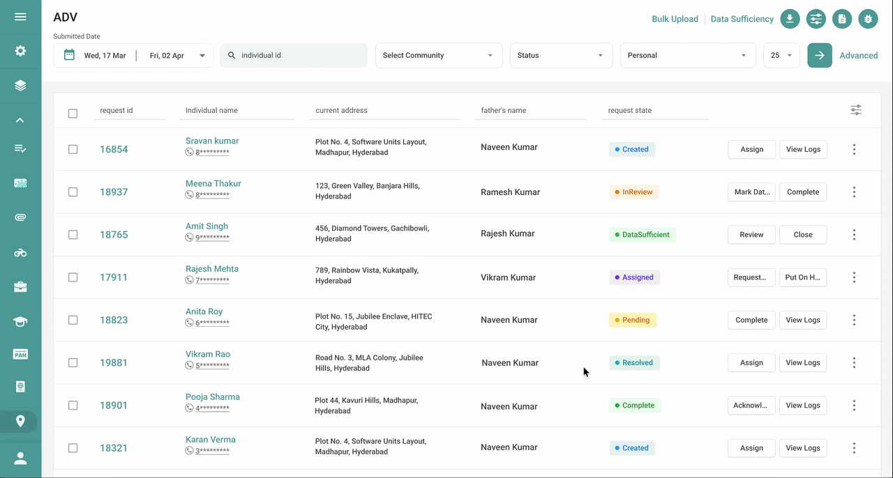
Color-coded status chips
The problem
Request states were displayed as plain text labels with no visual differentiation. In a workflow where operations staff handle hundreds of requests simultaneously, manually reading and interpreting every status label was slow and mentally exhausting. The lack of visual hierarchy also made it harder to identify what action was needed next — and which requests were blocked, pending, or complete.
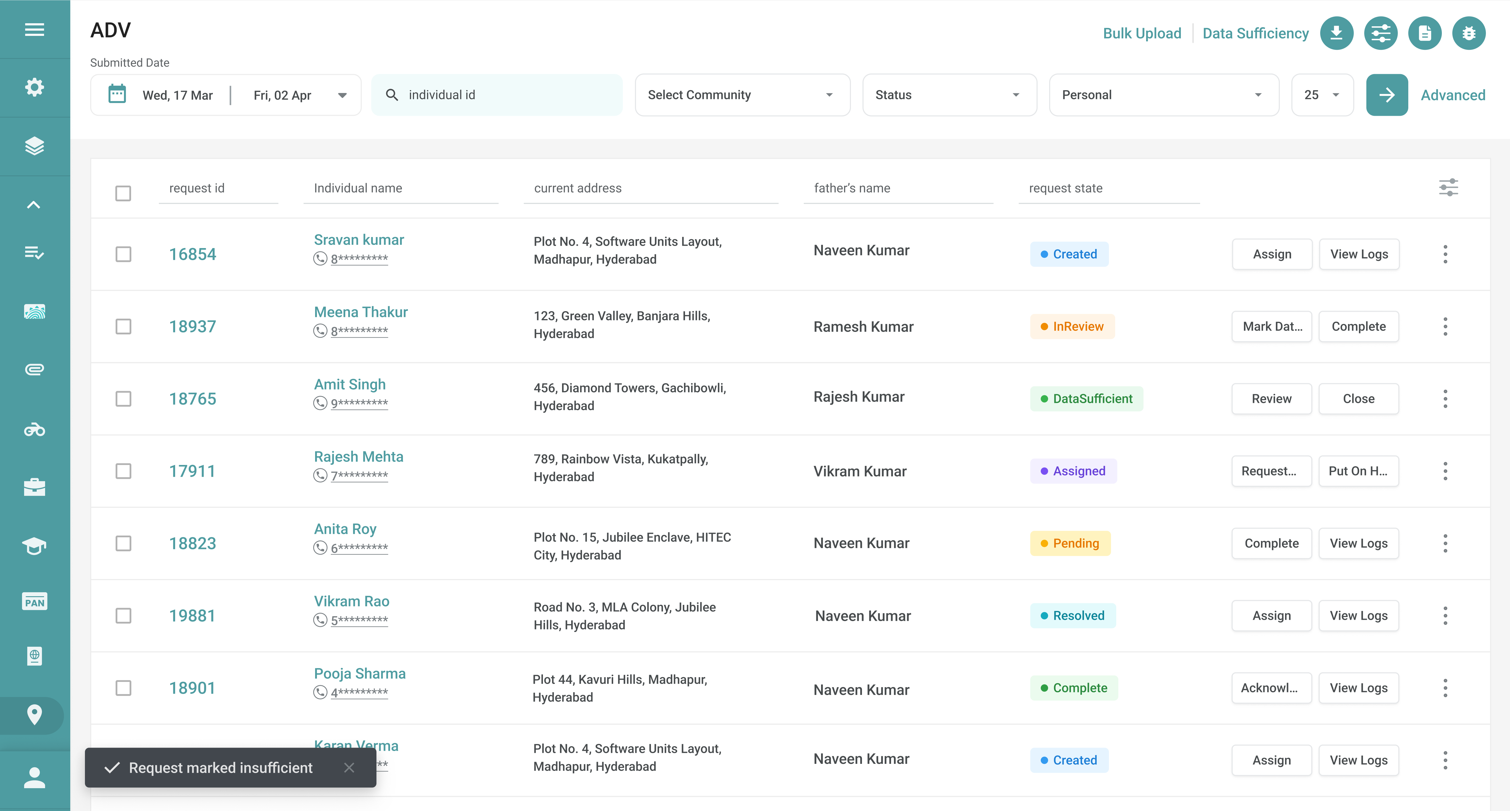
Each request state was assigned a distinct colour treatment — a chip that communicates status at a glance without reading. Users can now scan the full request table and instantly understand the state of every row. Cognitive effort dropped, operational awareness improved, and decision-making on which request to act on next became significantly faster — especially during high-volume periods.
Status Chips
Solution 08
Non-intrusive toast notifications
The problem
Workflow status updates were communicated through frequent modal pop-ups triggered by almost every action — request creation, assignment, status updates, verifier responses. While informative, these interruptions demanded acknowledgment before work could continue. For an ops team performing dozens of actions per hour, the cumulative disruption to task flow was significant.
Status updates now appear as non-intrusive toast notifications anchored at the bottom-left of the interface — visible, but never blocking. They appear and fade without requiring any user action. The system remains transparent about what's happening without pulling users out of their current task. Awareness is preserved; interruption is eliminated.
Notifications
Solution 09
Surfaced high-frequency toolbar
The problem
Three actions — Add Note, Data Suggestion, and Bug Reporting — were used repeatedly throughout every operational session. All three were buried inside secondary menus, requiring users to navigate away from their current task every time. Research revealed these weren't occasional utilities — they were core parts of the daily workflow, used multiple times per hour by every ops team member.
All three high-frequency actions were surfaced as a persistent contextual toolbar within the primary workspace — always visible, always one click away. Keeping essential tools at the surface of the interface eliminates the navigation overhead that had been quietly draining productivity across every session. Users stay in flow; the tool comes to them.
Toolbar